How FotoMedley's Coloring Page Generation Compares
Do you want to have person coloring pages that are easy to color? What makes for a good coloring page anyway? There are some simple approaches that are often used to convert photos into "sketches" or "coloring pages", but FotoMedley is different.
This article will examine the common approaches to converting images, and show what sets FotoMedley apart especially when looking at printed results.
1. Reviewing typical approaches
If you search the internet for ways to convert photos to sketches or coloring pages, you'll likely encounter a number of web sites, apps, or blogs that try to help you out. They majority of them will present a solution that involves applying a handful of image filters/operations to a photograph until arriving at something that loosely resembles a sketch or coloring page.
The basic formula goes something like this:
- Load image into a photo editing tool (e.g. Gimp, Photoshop).
- Desaturate the image so it's just grayscale.
- Make a duplicate layer for applying some filters.
- Perform some sequence of blue, invert, edge detection, and dodge filters.
- Apply some threshold or level adjustments.
- Be sure to manually tweak the filters to get it looking ok.
The end result is usually something that looks like a photograph that has had some image filters applied to it. You'll see that the photo is mostly white and it has emphasized edges and dark areas of the image. But it doesn't look like a drawing. And it doesn't look like a traditional coloring page, which would have bold lines and full enclosed coloring areas.
Here's an example:

Now we'll apply one of the available "convert to coloring sheet" or "convert to sketch" apps/websites that is available:
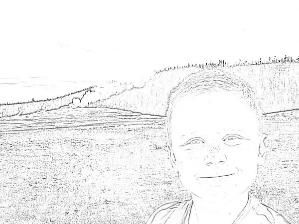
Not bad. The image definitely is black-and-white, and you can kind of see the edges. If we were to print this image out, we could certainly colorize it based on what has been produced. On the other had, the lines aren't really dark, and certainly not solid like a real coloring book.
Let's try manually applying the various image filters ourselves and tweak the settings to see if we get a better result.
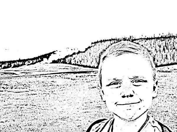
A bit better. You can see that the new image has a lot in common with the first, so the automatic conversion and the manual approach were obviously doing something similar. We were able to apply some different settings though, and the new image is a lot darker, although we still didn't manage to create a real coloring outline with real lines to color in.
Let's see what FotoMedley does with this same image.
2. Convert to a coloring page using FotoMedley
We're not going to walk through all of the steps for creating a coloring sheet in FotoMedley. We're really just interested in the results for our comparison. If you'd like learn how to use FotoMedley, please have a look at our other how-to articles.
When FotoMedley processes an image and converts it into a coloring sheet, it is not applying simple image filters and returning you a "Photoshopped" image. FotoMedley actually analyzes the image using artificial intelligence algorithms to try and understand the content of the image, and then traces the parts of the image it considers most relevant, and thereby is actually "drawing" a new coloring page based on the photo you uploaded. The process is one-of-a-kind and uses a lot of computing power.
It's worth noting that when processing the image, FotoMedley can focus in on just the subject of your photo and remove the background if you like.
Let's do it now and see how it turns out.
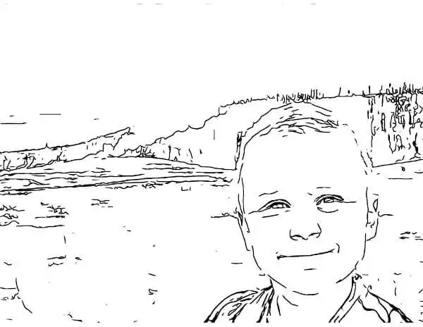
Pretty good. So, with basic settings, you can see that the photo definitely has real lines and has managed to ignore a lot of the noisy parts of the image, like the trees and grass, although it still leaves room for improvement.
As we describe in our articles about image processing settings, there are some alternate configurations we can apply to see if we can get some results that we like even more, so let's try some.
Here's one with a "fastest" complexity and background removal.
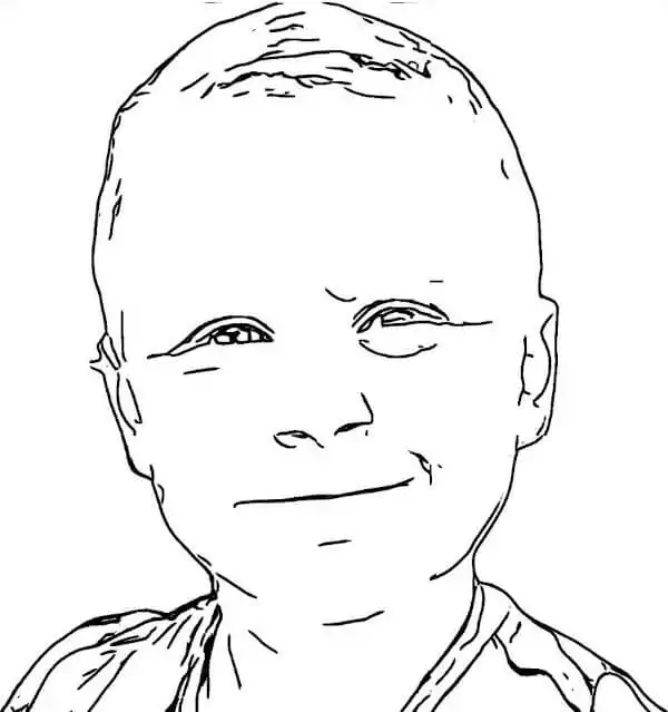
That result is arguably excellent. It has dark solid lines at have very few undesired gaps; it removed the background successfully; and it retained key facial features. In the image, you can really see that it was "drawn" rather than "Photoshopped". We wouldn't say this has reached the level of hand-crafted quality, but it's not bad.
Incidentally, there are a couple other image styles that FotoMedley can provide, so let's take a look at those for fun as well.
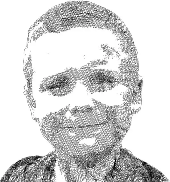
This one is actually a crosshatch sketch where you can see all of the individual lines that went into drawing it.
And one more:
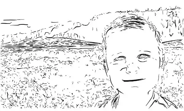
This last one is using the "sharpie" image processing option, and looks a bit more like a more like a flowing rough sketch in dark ink.
With all of these images, what we really wanted to see is the comparison between FotoMedley's coloring page generation versus the methods we've seen most often from other apps, websites, and tutorials. We think the results speak for themselves, but we have one last way we'd like to compare.
3. Print Comparison of Different Coloring Page Generation Methods
Ultimately, we were trying to make a coloring page, so let's do a head-to-head comparison of the printed result. These images are all printed on a black-and-white laser printer at the same quality. The FotoMedley image was printed from the 300DPI PDF received after purchasing the coloring sheets. The other images were printed from original resolution JPEGs.
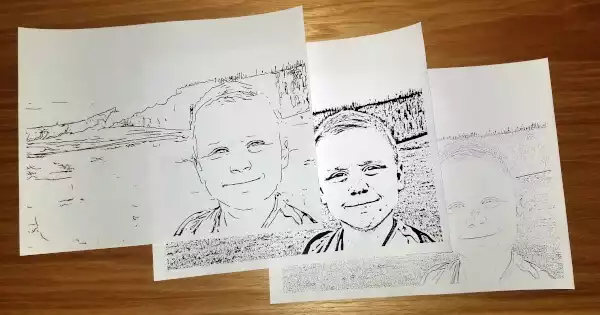
Next we'll compare a close up of the most important part of the image in each of the 3 prints.
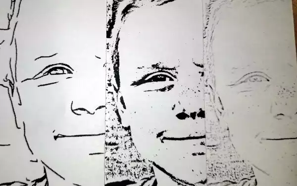
You can see the clear lines in the FotoMedley page, the dark but speckled output of our hand-Photoshopped image, and the light/washed out look of the first automated test we did. They're all usable in their way.
But the page we liked the most and want to color was this one:
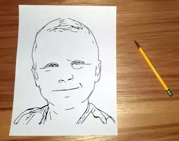
We hope this gives you a more clear understanding of how our custom coloring sheets differ from most of the alternatives out there. Choose what you like the best and have fun and enjoy coloring!