How FotoMedley’s AI Coloring Pages Compare
One deceptively difficult family photo, six very different drawings, and a printed face-to-face test reveal what actually makes a coloring page enjoyable—not merely black and white.
Meet the test photograph
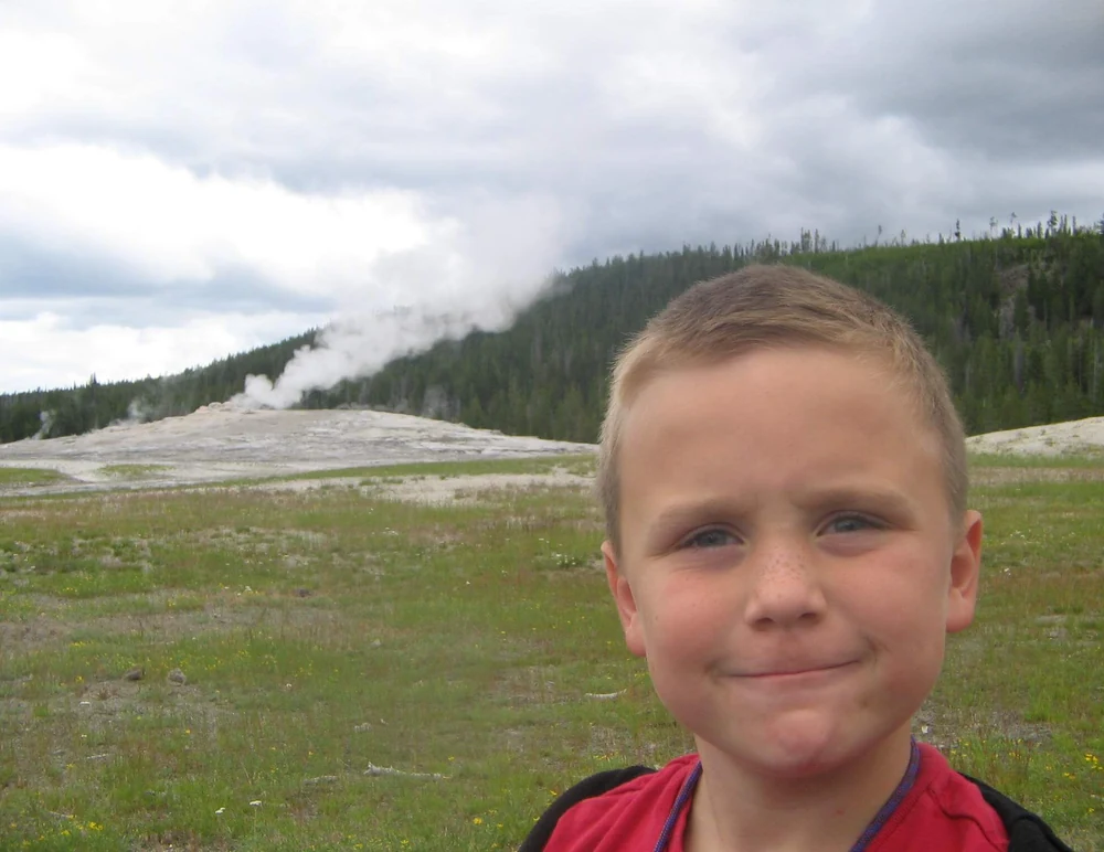
A smiling face in a very busy landscape
The boy’s expression should be the hero: the eyes, eyebrows, small smile, hairline, ears, and shoulder shape carry the likeness. The geyser makes the memory distinctive, but the grass and treeline contain far more detail than most people would enjoy coloring.
That creates a real design choice. Preserve the complete vacation scene and accept a denser page, or isolate the portrait and make something simpler and more approachable. Neither answer is automatically correct. The intended colorist decides which compromise is better.
- Must survive
- Eyes, smile, head shape, and expression
- Useful context
- Geyser and a hint of the landscape
- Reduce first
- Grass texture, trees, clouds, and tiny shadows
The four tests every result has to pass
Likeness
Does the face still feel like the same person?
Line confidence
Will the important marks survive an ordinary printer?
Colorability
Are there inviting spaces rather than gray visual noise?
Fit for purpose
Is the detail right for this person and this project?
Round 1 · Pixel-based conversion
When Every Edge Gets a Vote
A familiar photo-to-sketch recipe removes color, finds contrast changes, and adjusts brightness or thresholds. It is fast, deterministic, and sometimes attractive. It also has no opinion about whether a blade of grass matters less than an eyelid.
That weakness is obvious in this photograph. The automated version records a surprising amount of meadow and treeline texture while drawing the boy’s eyes and mouth so lightly that they nearly disappear. It preserves the photograph’s geometry, but it does not establish a visual hierarchy for coloring.
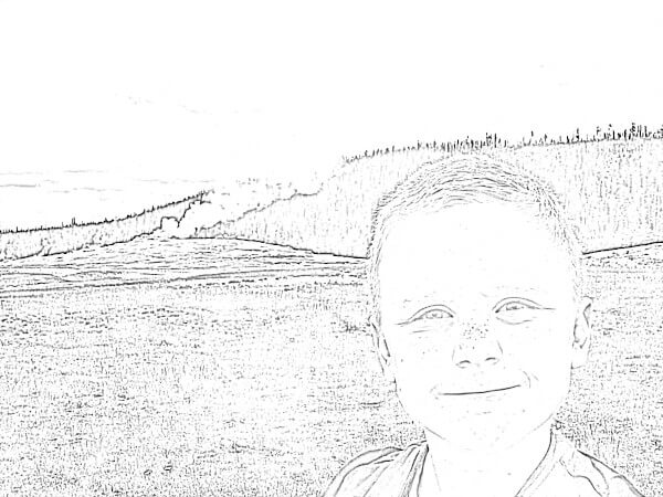
Automatic edge conversion
The setting is recognizable, but the face is pale and fragile. On a printer with slightly weak toner, the most important lines may be the first to vanish.
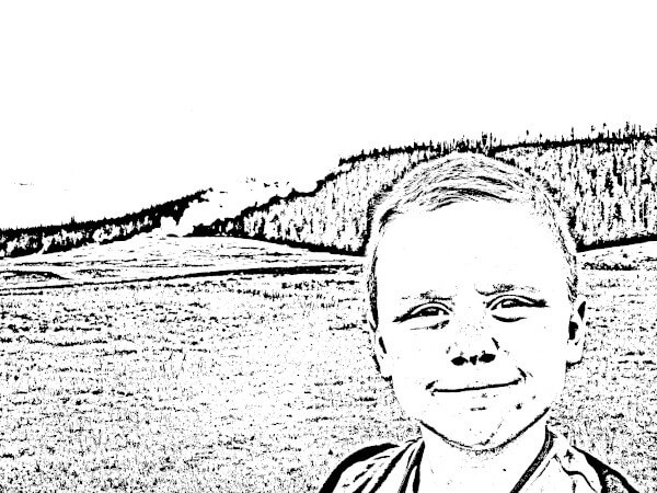
A darker manual adjustment
More contrast makes the result bolder, but it converts skin shadows, grass, and trees into speckles and black clusters. Darker is not the same as clearer.
Round 2 · Earlier FotoMedley processing
The First Big Improvement: Decide What Matters
Earlier FotoMedley tools went beyond a single stack of image filters. They could identify the subject, simplify portions of the scene, and produce several drawing languages. These archived examples are not previews of the current AI system, but they make the central design problem wonderfully visible.
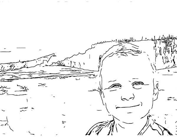
Keep the scene
The face gains cleaner, darker structure and the background is reduced to selected contours. It still feels like a vacation photograph, although the ground remains a fairly detailed coloring task.
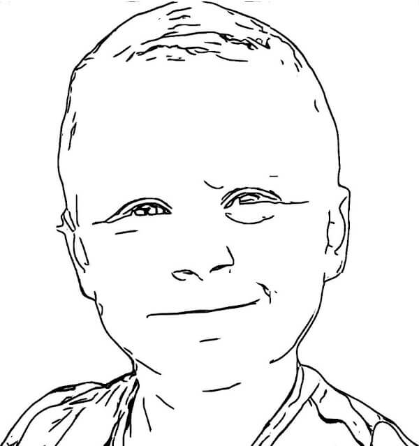
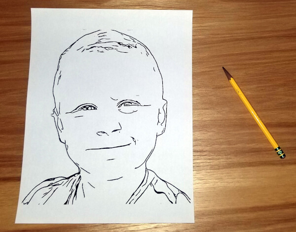
Keep the person
Removing the landscape transforms the experience. The eyes, smile, head, and shirt become the entire page. Broad white areas make it suitable for crayons, while the likeness remains surprisingly specific.
A Drawing Can Be Beautiful and Still Be the Wrong Coloring Page
The same subject can support entirely different kinds of mark-making. Crosshatching models shadow with hundreds of small strokes. A flowing marker sketch keeps the scene but gives every contour a loose, handmade rhythm. Both have more personality than a basic edge filter—and both change what the user is being invited to do.
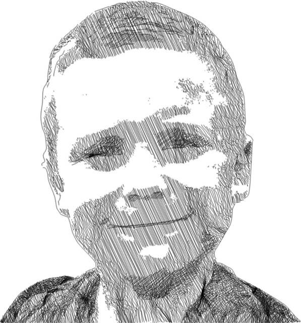
Crosshatch portrait
Excellent for people who enjoy drawing over texture, adding selective color, or treating the page like monochrome art. Less suitable for a young child looking for large empty shapes.
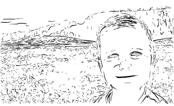
Flowing marker sketch
The setting remains lively and recognizable, but broken marks and dense grass texture make it closer to an expressive sketch than a conventional coloring-book page.
Round 3 · The printer tells the truth
Three Methods, One Black-and-White Printer
Screen previews are forgiving. A bright display can reveal faint gray lines, and zooming makes tiny texture feel intentional. Paper removes those advantages. These three versions were printed in black and white and photographed together, making the differences much harder to ignore.
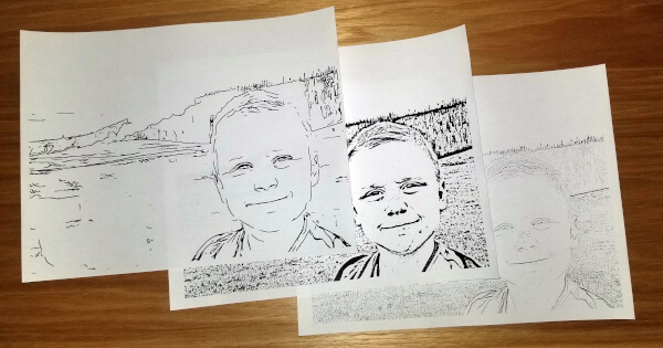
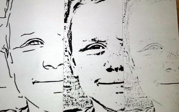
Read the eyes for fidelity—and for usability
The filtered eyes and mouth follow the source photograph most literally because they are derived from those exact pixels. The subject-aware drawing replaces them with a smaller set of deliberate marks, so their shape is necessarily an approximation. Yet on paper those simplified marks are darker, cleaner, and easier to understand. The filter wins the finest likeness test; the redrawn version usually wins the coloring-page test.
Round 4 · The current generative AI era
Today, the System Can Redraw the Idea of the Scene
FotoMedley’s current styles use generative AI. Instead of merely tracing selected edges, they interpret identity, pose, objects, and scene structure, then create new line art in a requested visual language. That enables stronger simplification and more coherent illustration, but every eye, mouth, contour, and background detail is being approximated. A generative result can remain recognizably the same person without preserving the finest likeness as exactly as a direct filter.
The useful question is no longer simply “Which conversion strength should I use?” It is “Which kind of drawing am I making?” Our three current results answer differently: Coloring Book prioritizes open coloring space, Ink Crosshatch adds controlled shading, and Sharpie Ink Sketch turns the memory into bold graphic artwork.
The 2026 rematch: one source, three current styles
These are genuine current FotoMedley results made from the same photograph. For presentation, the source and outputs have been placed in the same frame, so we can compare composition, likeness, texture, and empty space without unrelated crops changing the argument.
Fixed source image
The original asks a lot of the model: preserve a small expression, retain the geyser, and decide what to do with grass, trees, steam, and clouds.
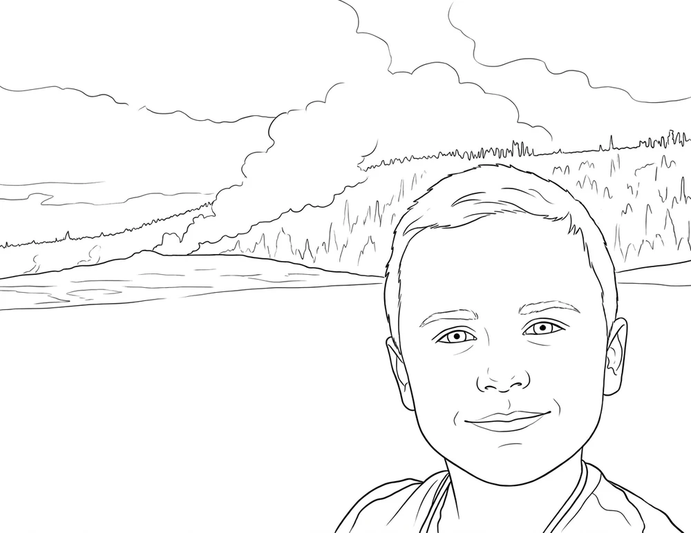
Coloring Book
The clearest coloring activity. It simplifies the meadow aggressively, describes the steam with confident contours, and keeps the face open and recognizable.
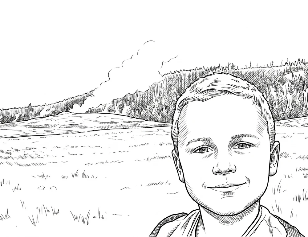
Ink Crosshatch Coloring Page
Crosshatching restores depth to the forest, hair, eyes, neck, and shirt while leaving the sky and much of the meadow available for color.
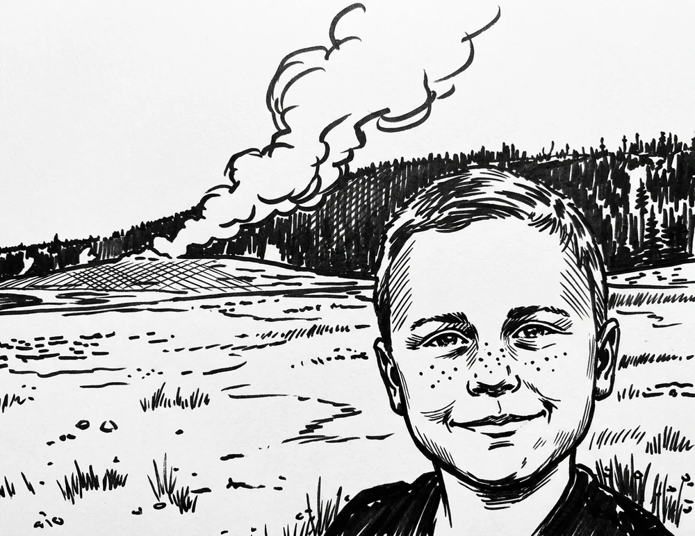
Sharpie Ink Sketch
The boldest interpretation. Heavy forest blacks and emphatic facial marks create the most dramatic artwork, but also pre-color more of the page for the user.
All three understand the photograph
That is the major leap from the filter examples. Each current style recognizes a boy in front of a geyser and redraws the scene coherently. The choice is no longer between faint edges and noisy edges; it is between three intentional drawing experiences.
Choose by Colorist, Not by Technology
| Colorist or purpose | Good starting point | Why |
|---|---|---|
| Young child with crayons | Coloring Book or Crayon Outline | Large spaces, bold contours, limited texture |
| Older child or casual adult | Coloring Book or Anime | Clear structure with more personality |
| Patient adult with pencils | Ink Crosshatch | Texture supports layering and fine detail |
| Personal keepsake or gift | Test two styles | Likeness may matter more than detail level |
Run a Small Test That Actually Teaches You Something
Use one clear photograph and make two purposeful variants—not six random ones. Start with Coloring Book as the baseline. Pair it with Ink Crosshatch for a patient pencil colorist or Sharpie Ink Sketch when the finished drawing matters more than large open coloring regions.
Download both, print them at the same size, and put the intended crayons, pencils, or markers beside them. Judge likeness, line confidence, open space, and tool fit. The better page is the one someone reaches for and wants to color.
- 1
Fix one source and crop
- 2
Choose a baseline and one challenger
- 3
Print both at identical size
- 4
Color a small area in each
The verdict
Basic filters preserve the finest likeness most faithfully because they continue to use the original photographic geometry. What they cannot do well is decide which accurate edges deserve to become strong lines, which textures should disappear, and where the colorist needs open paper. Current generative AI accepts a small risk of changing fine details in exchange for that editorial and stylistic control. In this test, Coloring Book produces the most inviting coloring page, Crosshatch balances coloring space with modeled detail, and Sharpie makes the strongest finished illustration. For coloring purposes, that tradeoff is usually well worth it.
Put one photograph through a fair test
Start with Coloring Book, add one style chosen for your colorist, then print both before deciding which result wins.
Compare Styles in Style Lab